

Section: Module 3: Lesson 2: Scatterplots and Line Charts | Let's Learn Excel | NextGenU.org
-
Student Learning Outcomes:
Upon completion of this lesson, you will be able to:
- Create single- and multiple-series scatterplots and line charts.
-
Students mustMark as done
Required Learning Resources and Activities
-
-
Students mustViewMake a submission
Activity 2, Module 3: Scatterplots and Line Graphs (30 minutes)
Part 1: Scatterplots
1. Open Excel.
2. Enter the data into your spreadsheet, as shown in the figure below.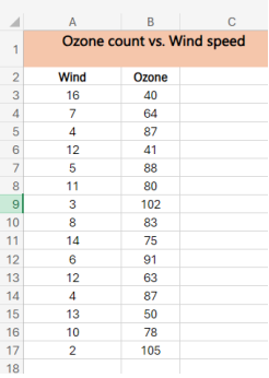
3. Use the given data to create a scatterplot. When selecting the data, do not include the merged cells A1 – C1.
4. Make the chart a large size for ease of use.
5. Give the chart the title “Wind Speed vs. Ozone Level in the Northern Region.”
6. Shade the background of the merged cells in a color of your preference.
7. Change the color of the dots to your preference by pointing the cursor at one of the dots, right-clicking, choosing “Format > Fill,” and selecting the color you want.Part 2: Line Graphs
1. Open Excel.
2. Open the dataset for the exercise “Dataset_Exercise2_Module3.xlxs.”
3. We are going to plot the line chart for all fruits for the month of January.
4. Select the range A2 to F3.
5. Get the line chart by going to “Insert,” then “Charts,” then “Line Chart,” with the first option of the smooth line or the option with the line plus the nodes. This is the line chart for January sales. Label it appropriately.
6. Now, we are going to make a line chart with the sales for all months of the year.
7. Select the range A2 to F12.
8. Go to “Insert,” then “Charts,” then “Line Chart.” Choose the option with the nodes to visualize the individual month lines more clearly.
9. This should give you a chart with 12 lines, one for the sales of fruit for each month.
10. Label the chart appropriately